An offline money app, explained in plain words
Rekhon · a short read · 7 documents to take away
What an offline money app does, and why it is built the way it is. Five minutes, no jargon, no prior knowledge assumed.
Below are six short pieces about an Android money app called Rekhon, written for somebody who has never written a line of code. No screenshots: the app is dense and small pictures of it explain nothing. Where a picture genuinely helps, there is one.
The documents come after. You will not need them to follow any of this, which is rather the point. Three proposals for redesigning the app used to sit down there too; they are their own thing and now have their own page.
It opens on one number
Most money apps open on your bank balance. Your balance lies to you. It happily counts money that already belongs to the landlord, to the electricity bill, and to the card you have not paid off yet.
This one opens on what is genuinely yours to spend this month, and it shows you the whole subtraction:
| Money that came in | ₹80,000 |
|---|---|
| Already spent | −₹12,400 |
| Payments due to leave | −₹18,000 |
| Bills not yet paid | −₹2,000 |
| Saving you asked for | −₹9,000 |
| Kept back for surprises | −₹4,000 |
| Safe to spend | ₹34,600 |
It shows its working, the way you had to at school
Tell it you want ₹30,000 headphones and it will not just say yes. It checks seven things and shows you all seven. Money left afterwards: ₹70,000, fine. Rent and loan payments: 30 percent, fine. Your savings goals: they would arrive about 60 days later than planned, which it calls worth knowing rather than fine.
Then the part most apps leave out. The time you could survive with no income at all drops from 2.4 months to 1.7. It still says yes. It just will not pretend the purchase was free.
| What it checked | Verdict | What it found |
|---|---|---|
| Money available | Fine | ₹1,00,000 now, ₹70,000 left afterwards |
| EMIs and rent | Fine | 30% of your income afterwards |
| Your goals | Worth knowing | They would arrive about 60 days later |
The robot is not allowed to do sums
There is an assistant you can ask questions. It is the same kind of thing that drafts your emails: good with words, and quietly, confidently terrible at arithmetic.
So it is banned from doing any. The app works every figure out first; the assistant only wraps figures it was handed in a sentence. Then another piece of code reads every digit in that sentence and checks it against what was actually worked out. A number the assistant made up never reaches you. Neither does a rounded one, because ₹34,600 softened into "about ₹35,000" is a different claim about your money.
Ask it something it cannot back up and it says so. One real answer from the app reads: I do not have enough recorded yet to answer that honestly. It would rather say nothing than say something it cannot stand behind.
The calculators
Thirty of them. They work out every figure.
₹34,600
The only number that now exists.
The assistant
Writes a sentence around the figure it was handed.
The checker
Reads every digit back and compares.
Every digit matches
The sentence reaches you.
Anything else
Refused — including “about ₹35,000”, which is a different claim.
Nothing about your money leaves the phone
There is no account to make and no password to lose, because there is no server on the other end holding one. It all sits on your phone, locked with a key the phone keeps in its own secure chip. Switch off the internet and everything still works, because nothing was asking the internet in the first place.
Anything optional — reading your bank text messages, fetching gold prices — has its own switch. Every switch starts off. Turn one off again and whatever depended on it stops at once, not at the next restart.
This is also why the code is public. "We do not send your money anywhere" is not something a shop listing can prove. Publishing it is what turns the promise into something a stranger can check.
| What happens | Where it happens | What leaves the phone |
|---|---|---|
| Working out every figure | On the phone | Nothing |
| Reading a photo of a receipt | On the phone | Nothing |
| Reading your bank texts | On the phone, only if you allow it | Nothing |
| Valuing gold you own | Asks the internet for today’s price | The price question — never an amount, never what you own |
Every place you can go, on one page
There are 25 screens. The dashboard is the middle of everything — twelve of the other twenty-four hang straight off it, and nothing at all is more than three taps from where the app opens.
Nobody drew this map. Every box and arrow is read out of the app’s own navigation code, so it cannot quietly stop matching the app. Add a screen nobody can reach, or describe one the code never opens, and the document refuses to build.
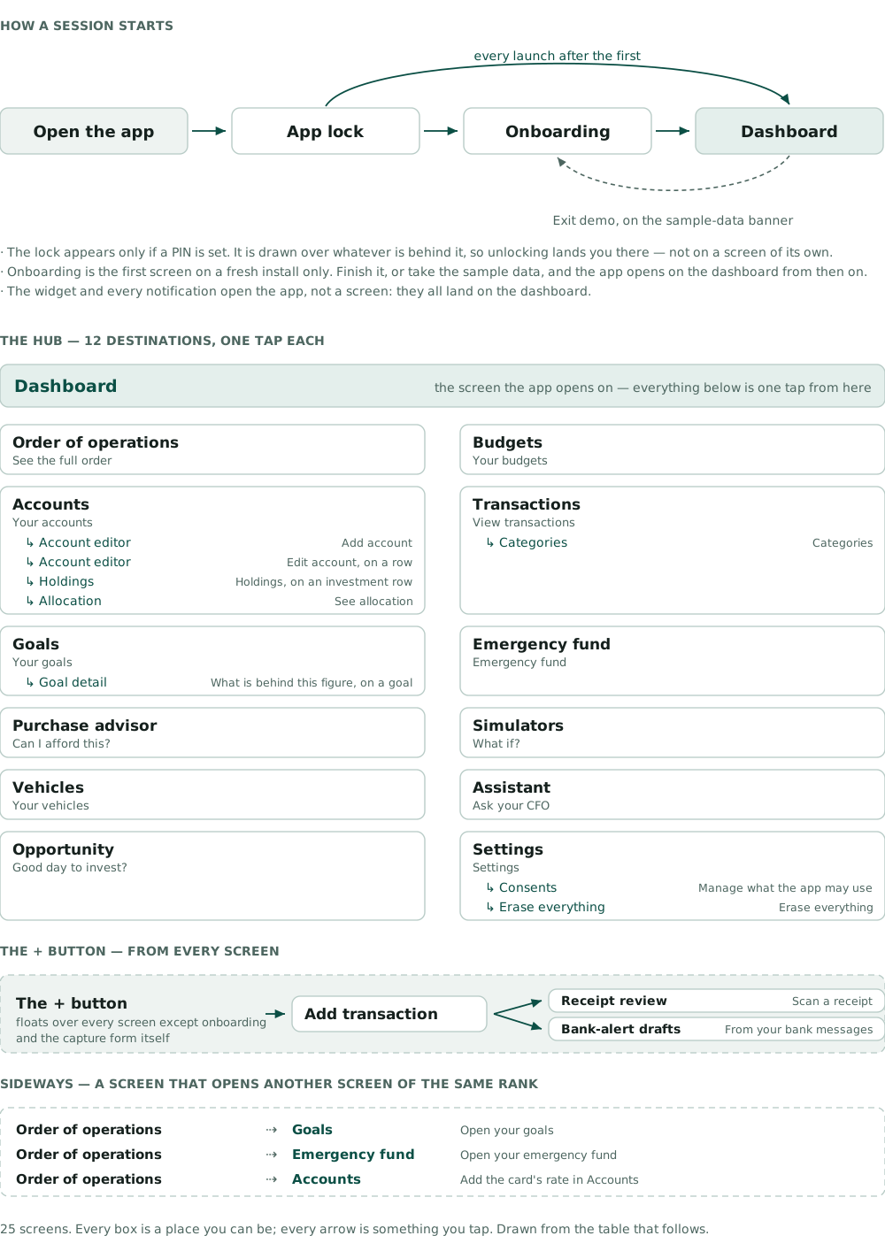
The rules are not notes. They are things that break.
The app is built in 60 separate pieces with the arrows between them pointing one way only. The pieces that do the arithmetic are not allowed to know anything about Android, which sounds like fussiness until you notice what it buys: the money sums can be tested on a laptop in seconds, with no phone involved.
None of that is written down and hoped for. Write a rupee as a decimal and the build stops. Read the clock in the wrong place and the build stops. Put somebody’s money in a log line and the build stops. That is the honest summary of the whole project, and it is why the documents below are worth anything.
Now the papers themselves
That was the short version. Underneath it sit 7 documents and 387 pages, free to download, none of which you need in order to have understood the article above. Each one gets the same four lines so you can tell in ten seconds whether you want it.
Every document gets the same four lines
What it is
the document in one or two plain sentences
Why I wrote it
the problem it solves, not the process that made it
Like this
an everyday thing it resembles
What’s inside
the real counts, read off the document itself
Start here
Two short ones. Between them they cover the whole project without any code in sight.
The short version
PDF3 pages0.4 MB
The whole project in three pages. If you read only one document on this page, read this one.
Why I wrote it, and what is insideClose
- Why I wrote it
- The full plan takes about two hours. Most people have ten minutes, and ten minutes is enough to decide whether the other two hours are worth it.
- Like this
- The short bedtime version of a very long story.
- What’s inside
- The seven rules the app is not allowed to break, everything it does, how it is put together in five lines, every count in one table, and a verdict at the end: ready, with risks. It also names the three questions worth answering first, which is the part I keep coming back to.
In the repo: docs/blueprint-summary.pdf
Why I built it
PDF38 pages5.7 MB
The story of the app: the problem I started with, how I went about it, and what I would say to each kind of person who asks.
Why I wrote it, and what is insideClose
- Why I wrote it
- Code does not explain itself. Somebody opening the repository can see what I built and still have no idea what I was trying to fix.
- Like this
- Show-and-tell. Here is the thing I made, and here is why I made it.
- What’s inside
- The pitch, the method, the build story, a page written for each kind of reader, and the decisions I still have not made.
The oldest document here, and its counts were true the day it was printed. The current ones are in the short version above.
In the repo: docs/AI_Personal_CFO_story.pdf
The full plan, and the faults in it
One document describes the app as it is. The other lists everywhere it falls short. They were written together, on purpose.
The big plan
PDF234 pages1.4 MB
Every part of the app written down properly: what it has to do, what it keeps, how the pieces fit, how it gets tested, and what could still go wrong.
Why I wrote it, and what is insideClose
- Why I wrote it
- I built the app first and wrote the plan afterwards, out of the code rather than out of my memory. A plan written from memory would have been wrong in a hundred small ways, and each one would have cost somebody an afternoon.
- Like this
- Drawing the picture on the Lego box after the castle is already built — then checking it brick by brick.
- What’s inside
- Twelve documents, five diagrams, and a checker that reads every ID in them and complains if one points nowhere. 95 things the app must do, 115 ways to tell whether it did, 55 user journeys written with their failure paths, 40 data tables, and 124 test cases.
In the repo: docs/project-blueprint/ai-personal-cfo-blueprint.pdf
The honest report
PDF6 pages0.4 MB
A list of everything about the app that is missing, unfinished, or not the way I said it would be.
Why I wrote it, and what is insideClose
- Why I wrote it
- Writing down what is broken is the only way it gets fixed. Hiding it does not make it go away; it means somebody else finds it, later, at a worse moment.
- Like this
- Telling your mum you broke the cup before she finds it.
- What’s inside
- 59 of 60 screens built. 35 data tables that were planned and never made, 33 of them deliberately. 19 files that grew past the length limit I set myself, the worst at 4,723 lines. Three speed targets with numbers that nothing actually measures. And one whole half of the system — the server — specified and never built.
Deliberately the least flattering document in the set. Of the 26 features that ship with a limitation, 22 are recorded decisions rather than unfinished work, and the report separates the two so a reader is not misled in either direction.
In the repo: docs/architecture-and-gap-report.pdf
The app as it actually is
What the thing looks like and how you move around it. The first two cannot go out of date, which is most of their point.
The picture book
PDF31 pages8.2 MB
A picture of every single screen in the app, with what each screen is for underneath it.
Why I wrote it, and what is insideClose
- Why I wrote it
- There was no way to see this app without building it first. Now there is. And these pictures cannot quietly go stale: the pictures are the test suite’s own output, so if a screen changes and its picture does not, the build goes red.
- Like this
- A photo album that refuses to keep an old photo. Change your hair and it makes you take a new one.
- What’s inside
- 25 screens and the component gallery, 115 pictures in all. Every screen in light, in dark, and at double-size text, with the dashboard also in Hindi, Kannada and Tamil. Every figure in every picture was computed by the real engine, not typed in to look plausible.
In the repo: docs/screens/SCREENS.pdf
The map
PDF24 pages3.6 MB
The map of the app. Which screen leads to which, exactly what you tap to get there, and what happens when you press Back.
Why I wrote it, and what is insideClose
- Why I wrote it
- A list of screens never tells you how anybody reaches one. This answers the question the picture book does not: how do I get there from here? It assumes you have never opened the app.
- Like this
- The map at the zoo. You are here, the lions are that way, two turns and you are back at the gate.
- What’s inside
- 25 screens and twelve journeys followed end to end. The dashboard is the middle of everything: twelve of the other twenty-four hang straight off it, and nothing is more than three taps from where the app opens.
Every arrow is read off the app’s own navigation code and every tap label is quoted from the text the user really sees, so the map cannot drift from the app. It also lists the six things that reading the whole graph turned up — including that tapping a notification opens the app rather than the screen it was about.
In the repo: docs/screens/USER_FLOW.pdf
The guided walk
PDF51 pages6.3 MB
A walk through the app a page at a time, naming the piece of maths that produced every number on every screen.
Why I wrote it, and what is insideClose
- Why I wrote it
- Showing a screen is not explaining it. For each figure on the page I wanted to point at the exact rule that made it, by name and version, so the answer can be reproduced rather than taken on trust.
- Like this
- A museum guide who stops at every painting and tells you who painted it.
- What’s inside
- 51 pages: each screen, what it is for, and the engine and rule behind each figure. Captured on a real phone in airplane mode on the app’s own demo data, so nothing in it belongs to a real person.
Taken by hand from a device, which is exactly why the picture book replaced it. Still the best document for understanding where a number came from.
In the repo: docs/AI_Personal_CFO_screens.pdf
And three ideas for what it could look like instead
Everything above describes the app that exists. Three separate proposals redraw all 25 screens three different ways, each arguing with the one before it. None has been adopted and none changed a line of code, so they live on their own page.
Where these come from
All 7 are copies of files in the app’s own repository, taken at version 0.13.10 on 23 October 2026 — the path under each download button is where the original lives. They are written and rebuilt alongside the code, not assembled for this page, which is the only reason the figures in them are worth anything.
One difference worth explaining before you notice it yourself. The case study counts 3,822 tests and 77 decision records, because it counts the public branch, which is still at v0.13.9. These documents describe v0.13.10, where the same two figures are 3,986 and 82. Same project, a fortnight apart, and both numbers were counted rather than remembered.
Every one of them is printed by a script from a source that lives beside the code, so none is a second copy somebody has to remember to update. Two go further: the picture book is assembled from the screenshots the test suite itself records, and the map is read off the app’s navigation code, so neither can disagree with the app without failing the build. The honest report is the one I would read first if I were deciding whether to trust the other ten.